Motion design in digital products: a white paper
Nov 02, 2018
In this article, I spell out the value of motion in digital products. I explain and dispute four myths held by designers, engineers, and stakeholders. Then I examine six challenges when it comes to delivering motion. I list the three ways that motion supports mental models in the minds of users. I conclude by listing sixteen metrics worth examining.
...
When it comes to innovating motion in digital products, designers, stakeholders, and engineers hold four old-world beliefs. These antiquated beliefs can make motion innovation an uphill battle for designers and motion advocates looking for opportunities and leverage, both with users and product metrics.
...
Belief 1: “Motion is not a core aspect of the user experience&radquo;
According to this belief, the core of the digital product is the research, UX, and engineering work that goes into executing the UX designs and screens. What follows from this belief is that motion is separate, something which does not play a major role in usability. This belief neglects examples like the Pinterest App where motion is used to simply and effectively transition users from a list view to a detail view with minimal impact during major context switching.

...
Belief 2: “Motion is just an add-on”
The second belief is that motion can be ‘added-on’ ‘at the end’. The idea here is that once the ‘real work’ has been done (designing static screens and making them interactive through code), the design and engineering team can begin thinking of ways to ‘add delight’ to the user experience. This belief neglects clear examples of interaction concepts that could not exist without motion (for example, the iOS app switcher is an entirely motion dependent interaction).

...
The third belief is that motion is animation. In this view, the term ‘animation’ includes things that move, and draws from a distinctly non-UX domain: that of classic animation. This builds on the first belief, that motion is not a core part of the user experience. In this view, motion is viewed as giving ‘personality’ to a product, though this term is poorly (if ever) defined, and when it is, often included with edge-case and rarely relevant examples. This belief neglects the fact that the principles of animation (from Disney) have no relevance to user interfaces, as I write about in a previous article here. These principles exist to solve a fundamentally different problem — character appeal and representing organic bodies in physical space, as well as maintaining quality control of a corporate product.

...
Belief 4: “Motion is context specific”
The fourth belief is that certain types of motion work best for certain contexts. In this belief, it may even be accepted that motion plays some (undefined) role in the user experience. However, in this belief, the role is murky and not well understood. According to this belief, certain classes of motion are best applicable to certain designs or scenarios in the interface, for example, the display of a menu. This belief is analogous to using a specific shade of blue that has been verified through rigorous testing to perform the best as a button. This belief neglects the fundamental complexity and variance of motion, nor does it consider motion itself to be a fundamental property of user experiences. This belief treats motion akin to a debugging tool for UX designers. It has the effect of silo-ing motion to specific use cases, rather than serving as a powerful partnership with the UX.
Six challenges to succeeding with motion
Linguistic
Part of the underlying challenge of this topic is linguistic: our vocabulary lacks a word or concept for ‘motion interactivity’ or ‘motion that occurs in the context of users interacting with a digital product’ — and excluding the passive motion that one would see in an animated film. The only two words we have to express this idea are ‘motion,’ and (unfortunately, in my view) ‘animation.’
Temporal
A further challenge comes from the modality that designers are most comfortable designing in — static screens. Motion challenges us to think in terms of behavior over time, mental models, and alignments and partnerships with the UX. Designers, engineers, and stakeholders are for the most part unfamiliar with this modality of design. This unfamiliarity results in friction and chaos in an already complex process.
Complexity
A third challenge comes from the inherent complexity of motion itself. Due to the fundamentally variant nature of motion, small changes in the motion design can have large impacts on the user. This makes design challenging and difficult to validate due to the relentless versioning motion requires. For example, merely changing velocity curves can completely transform how users perceive an interaction.
Data
A fourth challenge comes from the lack of hard data supporting the value of motion. This lack of credible information makes a powerful case against motion: if we can’t assert a positive ROI in advance, why invest in a resource expensive project?
Tools
A fifth challenge comes from reliance on prototyping tools as a way to learn and ideate. The common idea designers have is to select a prototyping tool, watch tutorials, and learn how to ‘do motion.’ Due to the nature of content creation and keyword searching, these tutorials rarely condition designers to actually ideate, and instead focus on solving small contextualized problems.
Resources
A sixth challenge comes from a lack of resources that clearly and succinctly speak to the value of motion. Most books and articles on the topic of motion in digital products tend to focus on trend mapping, rather than a solid mental model based foundation for designers to work with, or a metric based language for designers to use in conversations with stakeholders.
The value of motion
Now that we’ve covered myths and challenges, I’d like to address what I see as the core value that motion brings to digital products.
Primo
Simply put, motion serves as an explanation to the user of how one gets to-and-from various places in the interface. This explanation can be thought of in terms of coherence: the degree to which the explanation aligns with the UX, content, and mental models.

In the iOS app switcher, the motion tells the user the following story:
“Once upon a time, dear user, you were happily in the world of your app. Now you have ‘zoomed out’ and are in a new world comprised of other worlds, where each world is another app.”
This narrative would not have been possible without motion. To imagine this without motion, play the interaction with a simple cut. What you are left with is that the beginning and end states of the interaction are conceptually distant. Motion connects these two conceptually distant ideas (Idea 1: the world of the app, Idea 2: the world of worlds) and offers a coherent explanation.

In this view, motion is a fundamental part of the user experience, both from a design methodology and from what the user experiences. Motion is not something added on at the end, but something that requires consideration during the design of any two screens.
This has the effect of removing motion from the category of animation and treating it as something distinct in its own right. Lastly, because it is fundamental, it is not something that is only best used in certain scenarios but throughout the design process.
A design heuristic
As a general heuristic, the further the conceptual distance between two states, the greater the case for motion. For example, conceptually, a simple switch has two states: on and off. These states are conceptually close to each other, which is why motion is not required to make the interaction effective.


In the example on the left, there is no motion. The motion on the right has motion, which implies a process, and is not accurate. Credit Delacro
Secundo (mental models)
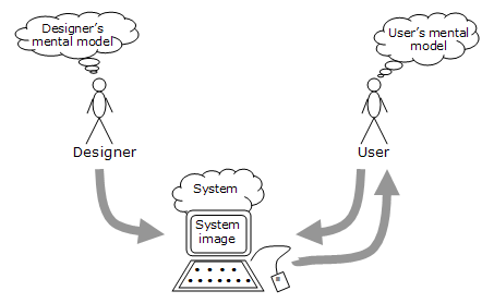
Mental models exist in the minds of users and have been well documented in various UX design literature and in The Design of Everyday Things by Don Norman. To recap this idea, the working context is best represented by the 3 variable visual representation between the designer’s mental models, the design of the system itself, and the user’s mental model.

In my workshops, I make the case that what we call ‘motion’ plays a large role in mental models, and specifically in how users perceive what objects in the interface are and what they do. Motion accomplishes this either by partnering with existing mental models or by creating new mental models using a combination of the following 3 methods.
1. Skeuomorphic behavior
Users have existing mental models for navigating and interacting with their physical environment. By identifying and capitalizing on these mental models, designers can interface directly with user perception and reasoning. I have documented a list of 12 useful mental models and their direct translation into user interfaces, through motion, in a previous article. In this example from IGTV, the user navigates a feed by the spatially intuitive gesture akin to rotating a cube. ‘Previous’ and ‘next’ are now rendered spatially in the mind of the user, leveraging innate perceptive and reasoning abilities.

2. Rules
Humans are wired to learn rules. While much has been written to the effect of avoiding having users learn new systems and rules, it nevertheless remains an opportunity. This is best demonstrated by the ‘permanent state of change’ that we find in user experiences throughout the past, and, one can surmise, well into the future. Said differently, there is always going to be an edge or gap between the next thing and the current thing. This gap places the demand to learn on users, and as we have already seen, users have proved themselves capable of learning new interaction paradigms and metaphors. Motion plays a significant role in defining and reinforcing new rules.
3. Affordances and signifiers
Visual signifiers in the static design of screens imply cause and effect behaviors (i.e. motion) in the interface. These signifiers are the stand-ins for what the motion affords. The subsequent motion either aligns or conflicts with these signifiers, thus providing a powerful opportunity for designers to get it right.
Impact and metrics
Sixteen possible metrics for motion include, and are not limited to the following. In making a case for motion in your projects, I recommend working strategically by identifying metrics and developing assertions and hypothesis prior to committing resources.
- Ease of use
- Task success rate
- Keeping users oriented during context switching
- Helping users stay focused in the task domain rather than interface domain
- Flow state
- Trust rating
- Minimizing confusion and frustration
- Speed of use
- Ways to combine interaction and perception
- Confusion moments
- Form completion
- List to detail transitions
- Feedback
- Expectation
- Recollection of key interface elements
- Task prioritization.
In conclusion, motion in digital products can be a powerful tool, both for designers looking to connect with users, and for product managers looking for metric driven approaches to solving problems. Motion, due to it’s complexity can be challenging to deliver, but when done well, it has the potential to connect with user mental models, and drive product results.
Don't miss a beat!
New moves, motivation, and classes delivered to your inbox.
We hate SPAM. We will never sell your information, for any reason.


